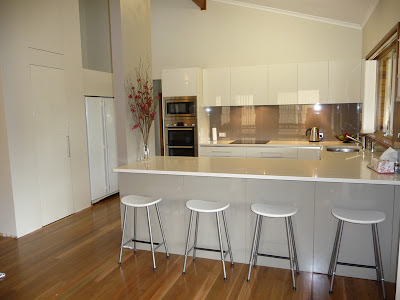
So here is what we've picked! The mosaic tiles will be our splash back and it's a little hard to tell from the picture but there is brushed silver, white glass and a latte coloured natural stone which ties all the colours of the kitchen in perfectly (polar white cupboards, stainless steel appliances and latte coloured bench top). Plus we thought it would add a bit of interest in the kitchen over all.
We've chosen stipple seal laminex for our bench tops, polar white for cupboards / drawers and Alaskan for the back of the Island Bench. Waiting on some quotes but if they come in ok, we'll go the polyurathane cupboards etc instead of polar white.
ETA: polyurathane ended up about triple the price through this particular company.....ummmm, no thanks.
I know it's a bit hard to see but here's our kitchen design (sorry it's a bit blurry).
There are 4 rear opening storage cupboards on back of island, 3 pot drawers on either side of oven, 900mm freestanding oven and overhead cupboards with downlights shining down on bench.
In the pantry I have added an extra shelf so in total there will be 5 melamine shelves all the way around (wanted to maximise space) and you might notice at the front of WIP I have asked them to leave a handy space to hang a broom, mop etc for quick clean ups. We'll also be housing our microwave, kettle & toaster in the WIP, you can see where I've put the arrow, so there is going to be a powerpoint there.
The following pic is an example of the rear opening 'touch' cupboards we'll be having and the downlights under the overhead cupboards.
And here's what the cupboard looks like closed. Love!
This is the Dorf Vege Sprayer tap we chose. As the name suggests the tap extends out to act as a......wait for it.......vege sprayer! I love the really tall dramatic looking taps but our sink is facing into the family room and I didn't want it to stand out too much.
This is the 900mm freestanding Technika oven we upgraded to. As far as reviews go, not the best out there but it was only about $700 to upgrade so we were happy with that. That's a drawer underneath the oven too, handy for baking trays.
And lastly, here's a computerised idea of all the colours together (for the life of me I cannot remember the software we used but google free kitchen design software and something will show up for you.
Very rough but it helps to give an idea...


2 comments:
Should look good!
Hi - the amount of info you are giving is great!!! Love the timber floors! I love timber! My partner and I are planning an Eden Brae - at the very start of the process. I have a blog going - http://strawsticksandbricks.blogspot.com/ Its good to keep all your ideas in once place. I have been filling mine with design ideas. But soon it will be house stuff!! Good luck and keep up all that info!! Di Lorenzo scares me a lil =(
Post a Comment